In February, this paper claimed that there's a 75% chance the next El Niþo will arrive by the end of 2014:
• Josef Ludescher, Avi Gozolchiani, Mikhail I. Bogachev, Armin Bunde, Shlomo Havlin, and Hans Joachim Schellnhuber, [Very early warning of next El Niþo](http://www.climatelinc.eu/fileadmin/UG_ADVANCED/Publications/BIU_-_Avi__Halvin__et_al-Very_early_warning_of_next_El_Nino.pdf), Proceedings of the National Academy of Sciences, February 2014. (Click title for free version, journal name for official version.)
Since it was published in a reputable journal, it created a big stir! Being able to predict an El Niño more than 6 months in advance would be a big deal. El Niños can cause billions of dollars of damage.
But that's not the only reason we at the Azimuth Project want to analyze, criticize and improve this paper. Another reason is that it uses a climate network—and we like network theory.
Very roughly, the idea is this. Draw a big network of dots representing different places in the Pacific Ocean. For each pair of dots, compute a number saying how strongly correlated the temperatures are at those two places. The paper claims that when a El Niño is getting ready to happen, the average of these numbers is big. In other words, temperatures in the Pacific tend to go up and down in synch!
Whether this idea is right or wrong, it's interesting— and it's not very hard for programmers to dive in and study it.
Two Azimuth members have done just that: David Tanzer, a software developer who works for financial firms in New York, and Graham Jones, a self-employed programmer who also works on genomics and Bayesian statistics. These guys have really brought new life to the Azimuth Code Project in the last few weeks, and it's exciting! It's even gotten me to do some programming myself.
Soon I'll start talking about the programs they've written, and how you can help.
But today I'll summarize the paper by Ludescher et al. Their methodology is also explained here:
• Josef Ludescher, Avi Gozolchiani, Mikhail I. Bogachev, Armin Bunde, Shlomo Havlin, and Hans Joachim Schellnhuber, Improved El Niþo forecasting by cooperativity detection, Proceedings of the National Academy of Sciences, 30 May 2013.
The basic idea
The basic idea is to use a climate network. There are lots of variants on this idea, but here's a simple one. Start with a bunch of dots representing different places on the Earth. For any pair of dots $latex i$ and $latex j$, compute the cross-correlation of temperature histories at those two places. Call some function of this the 'link strength' for that pair of dots. Compute the average link strength... and get excited when this gets bigger than a certain value.
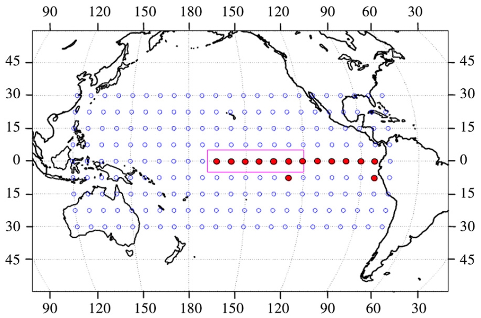
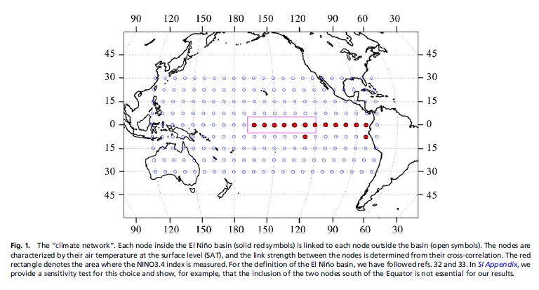
The papers by Ludescher et al use this strategy to predict El Niños. They build their climate network using correlations between daily temperature data for 14 grid points in the El Niþo basin and 193 grid points outside this region, as shown here:
The red dots are the points in the El Niño basin.
Starting from this temperature data, they compute an 'average link strength' in a way I'll describe later. When this number is bigger than a certain fixed value, they claim an El Niño is coming.
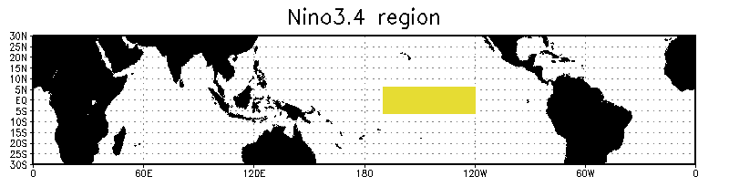
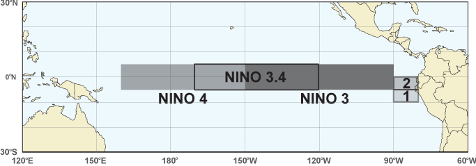
How do they decide if they're right? How do we tell when an El Niño actually arrives? One way is to use the 'Niño 3.4 index'. This the area-averaged sea surface temperature anomaly in the yellow region here:
Anomaly means the temperature minus its average over time: how much hotter than usual it is. When the Niño 3.4 index is over 0.5°C for at least 3 months, Ludescher et al say there's an El Niño.
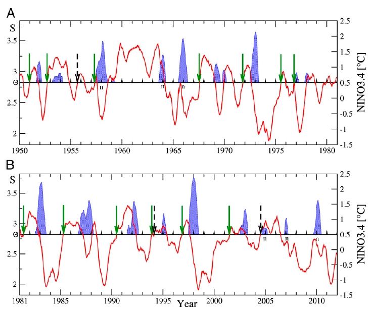
Here is what they get:
The blue peaks are El Niños: episodes where the Niño 3.4 index is over 0.5°C for at least 3 months.
The red line is their 'average link strength'. Whenever this exceeds a certain threshold $latex \Theta = 2.82$, and the Niño 3.4 index is not already over 0.5°C, they predict an El Niño will start in the following calendar year.
The green arrows show their successful predictions. The dashed arrows show their false alarms. A little letter n appears next to each El Niño that they failed to predict.
You're probably wondering where the number $latex 2.82$ came from. They get it from a learning algorithm that finds this threshold by optimizing the predictive power of their model. Chart A here shows the 'learning phase' of their calculation. In this phase, they adjusted the threshold $latex \Theta$ so their procedure would do a good job. Chart B shows the 'testing phase'. Here they used the value of $latex \Theta$ chosen in the learning phase, and checked to see how good a job it did. I'll let you read their paper for more details on how they chose $latex \Theta$.
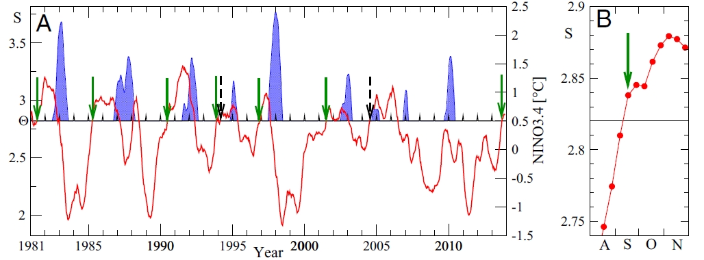
But what about their prediction now? That's the green arrow at far right here:
On 17 September 2013, the red line went above the threshold! So, their scheme predicts an El Niño sometime in 2014. The chart at right is a zoomed-in version that shows the red line in August, September, October and November of 2014.
The details
Now I mainly need to explain how they compute their 'average link strength'.
Let $latex i$ stand for any point in this 9 × 27 grid:
For each day $latex t$ between June 1948 and November 2013, let $latex \tilde{T}_i(t)$ be the average surface air temperature at the point $latex i$ on day $latex t$.
Let $latex T_i(t)$ be $latex \tilde{T}_i(t)$ minus its climatological average. For example, if $latex t$ is June 1st 1970, we average the temperature at location $latex i$ over all June 1sts from 1948 to 2013, and subtract that from $latex \tilde{T}_i(t)$ to get $latex T_i(t)$. They call $latex T_i(t)$ the temperature anomaly.
(A subtlety here: when we are doing prediction we can't know the future temperatures, so the climatological average is only the average over past days meeting the above criteria.)
For any function of time, denote its moving average over the last 365 days by:
$latex \displaystyle{ \langle f(t) \rangle = \frac{1}{365} \sum_{d = 0}^{364} f(t - d) }$
Let $latex i$ be a point in the El Niþo basin, and $latex j$ be a point outside it. For any time lags $latex \tau$ between 0 and 200 days, define the time-delayed cross-covariance by:
$latex \langle T_i(t) T_j(t - \tau) \rangle - \langle T_i(t) \rangle \langle T_j(t - \tau) \rangle $
Note that this is a way of studying the linear correlation between the temperature anomaly at node $latex i$ and the temperature anomaly a time $latex \tau$ earlier at some node $latex j$. So, it's about how temperature anomalies inside the El Niño basin are correlated to temperature anomalies outside this basin at earlier times.
Ludescher et al then normalize this, defining the time-delayed cross-correlation $latex C_{i,j}^{t}(-\tau)$ to be the time-delayed cross-covariance divided by
$latex \sqrt{\langle (T_i(t) - \langle T_i(t)\rangle)^2 \rangle} \;
\sqrt{\langle (T_j(t-\tau) - \langle T_j(t-\tau)\rangle)^2 \rangle} $
This is something like the standard deviation of $latex T_i(t)$ times the standard deviation of $latex T_j(t - \tau)$. Dividing by standard deviations is what people usually do to turn covariances into correlations. But there are some potential problems here, which I'll discuss later.
They define $latex C_{i,j}^{t}(\tau)$ in a similar way, by taking
$latex \langle T_i(t - \tau) T_j(t) \rangle - \langle T_i(t - \tau) \rangle \langle T_j(t) \rangle $
and normalizing it. So, this is about how temperature anomalies outside the El Niño basin are correlated to temperature anomalies inside this basin at earlier times.
Next, for nodes $latex i$ and $latex j$, and for each time point $latex t$, they determine the maximum, the mean and the standard deviation of $latex |C_{i,j}^t(\tau)|$, as $latex \tau$ ranges from -200 to 200 days.
They define the link strength $latex S_{i j}(t)$ as the difference between the maximum and the mean value, divided by the standard deviation.
Finally, they let $latex S(t)$ be the average link strength, calculated by averaging $latex S_{i j}(t)$ over all pairs $latex (i,j)$ where $latex i$ is a node in the El Niþo basin and $latex j$ is a node outside.
They compute $latex S(t)$ for every 10th day between January 1950 and November 2013. When $latex S(t)$ goes over 2.82, and the Niño 3.4 index is not already over 0.5°C, they predict an El Niño in the next calendar year.
There's more to say about their methods. We'd like you to help us check their work and improve it. Soon I want to show you Graham Jones' software for replicating their calculations! But right now I just want to conclude by:
• mentioning a potential problem in the math, and
• telling you where to get the data used by Ludescher et al.
Mathematical nuances
Ludescher et al normalize the time-delayed cross-covariance in a somewhat odd way. They claim to divide it by
$latex \sqrt{\langle (T_i(t) - \langle T_i(t)\rangle)^2 \rangle} \;
\sqrt{\langle (T_j(t-\tau) - \langle T_j(t-\tau)\rangle)^2 \rangle} $
This is a strange thing, since it has nested angle brackets. The angle brackets are defined as a running average over the 365 days, so this quantity involves data going back twice as long: 730 days. Furthermore, the 'link strength' involves the above expression where $latex \tau$ goes up to 200 days.
So, taking their definitions at face value, Ludescher et al could not actually compute their 'link strength' until 930 days after the surface temperature data first starts at the beginning of 1948. That would be late 1950. But their graph of the link strength starts at the beginning of 1950!
So, it's possible that they actually normalized the time-delayed cross-covariance by dividing it by this:
$latex \sqrt{\langle T_i(t)^2\rangle - \langle T_i(t)\rangle^2 } \;
\sqrt{\langle T_j(t-\tau)^2 \rangle - \langle T_j(t-\tau)\rangle^2} $
This simpler expression avoids nested angle brackets. It makes more sense conceptually. This is the standard deviation of $latex T_i(t)$ over the last 365 days, times the standard deviation of $latex T_i(t-\tau)$ over the last 365 days.
Surface air temperatures
Remember that $latex \tilde{T}_i(t)$ is the average surface air temperature at the grid point $latex i$ on day $latex t$. You can get these temperatures from here:
• National Centers for Environmental Prediction and the National Center for Atmospheric Research Reanalysis I Project.
More precisely, there's a bunch of files here containing worldwide daily average temperatures on a 2.5° latitude × 2.5° longitude grid (144 × 73 grid points), from 1948 to 2010. If you go here the website will help you get data from within a chosen rectangle in a grid, for a chosen time interval. These are 'NetCDF files', a format we will discuss later, when we get into more details about programming!
Niño 3.4
**Niño 3.4** is the area-averaged sea surface temperature anomaly in the region 5°S-5°N and 170°-120°W. You can get Niño3.4 data here:
* Niño 3.4 data, NOAA.
Niño 3.4 is just one of several official regions in the Pacific:
• Niþo 1: 80°W-90°W and 5°S-10°S.
• Niþo 2: 80°W-90°W and 0°S-5°S
• Niþo 3: 90°W-150°W and 5°S-5°N.
• Niþo 3.4: 120°W-170°W and 5°S-5°N.
• Niþo 4: 160°E-150°W and 5°S-5°N.
For more details, read this:
• Kevin E. Trenberth, The definition of El Niþo, Bulletin of the American Meteorological Society 78 (1997), 2771–2777.