
The best thing about being a statistician is that you get to play in everyone's backyard.Anyone who doubts the fun of doing so, or how statistics enables such, should read Young.
Figure 1. Ocean temperatures at depth, from Yale Climate Forum.[/caption]
A similar graph is shown in the important series recapping the recent IPCC Report by Steve Easterbrook. A great deal excess heat is going into the oceans. In fact, most of it is, and there is an especially significant amount going deep into the southern oceans, something which may have implications for Antarctica.
This can happen in many ways, but one dramatic way is due to a phase of the El Niño Southern Oscillation} ("ENSO"). Another way is storage by the Atlantic Meridional Overturning Circulation ("AMOC") [Ko2014].
The trade winds along the Pacific equatorial region vary in strength. When they are weak, the phenomenon called El Niño is seen, affecting weather in the United States and in Asia. Evidence for El Niño includes elevated sea-surface temperatures ("SSTs") in the eastern Pacific. This short-term climate variation brings increased rainfall to the southern United States and Peru, and drought to east Asia and Australia, often triggering
[caption id="attachment_1106" align="alignleft" width="300"] Figure 2. Oblique view of variability of Pacific equatorial region from El Niño to La Niña and back. Vertical height of ocean is exaggerated to show piling up of waters in the Pacific warm pool.[/caption]
large wildfires there. The reverse phenomenon, La Niña, is produced by strong trades, and results in cold SSTs in the eastern Pacific, and plentiful rainfall in east Asia and northern Australia. Strong trades actually pile ocean water up against Asia, and these warmer-than-average waters push surface waters there down, creating a cycle of returning cold waters back to the eastern Pacific. This process is depicted in Figures 2 and 3.
Figure 2. Oblique view of variability of Pacific equatorial region from El Niño to La Niña and back. Vertical height of ocean is exaggerated to show piling up of waters in the Pacific warm pool.[/caption]
large wildfires there. The reverse phenomenon, La Niña, is produced by strong trades, and results in cold SSTs in the eastern Pacific, and plentiful rainfall in east Asia and northern Australia. Strong trades actually pile ocean water up against Asia, and these warmer-than-average waters push surface waters there down, creating a cycle of returning cold waters back to the eastern Pacific. This process is depicted in Figures 2 and 3.
 Figure 3. Trade winds vary in strength, having consequences for pooling and flow of Pacific waters and sea surface temperatures.[/caption]
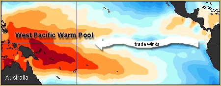 Figure 4. Strong trade winds cause the warm surface waters of the equatorial Pacific to pile up against Asia.[/caption]
Documentation of land and ocean surface temperatures is done in variety of ways. There are several important sources, including Berkeley Earth, NASA GISS, and the Hadley Centre/Climatic Research Unit ("CRU") data sets [Ro2013a, Ha2010, Mo2012] The three, referenced here as BEST, GISS, and HadCRUT4, respectively, have been compared by Rohde. They differ in duration and extent of coverage, but allow comparable inferences. For example, a linear regression establishing a trend using July monthly average temperatures from 1880 to 2012 for Moscow from GISS and BEST agree that Moscow's July 2010 heat was 3.67 standard deviations from the long term trend [GISS-BEST]. Nevertheless, there is an important difference between BEST and GISS, on the one hand, and HadCRUT4.
BEST and GISS attempt to capture and convey a single best estimate of temperatures on Earth's surface, and attach an uncertainty measure to each number. Sometimes, because of absence of measurements or equipment failures, there are no measurements, and these are clearly marked in the series. HadCRUT4 is different. With HadCRUT4 the uncertainty in measurements is described by a hundred member ensemble of values, actually a 2592-by-1967 matrix. Rows correspond to observations from 2592 patches, 36 in latitude, and 72 in longitude, with which it represents the surface of Earth. Columns correspond to each month from January 1850 to November 2013. It is possible for any one of these cells to be coded as "missing". This detail is important because HadCRUT4 is the basis for a paper suggesting the pause in global warming is structurally inconsistent with climate models. That paper will be discussed later.
Figure 4. Strong trade winds cause the warm surface waters of the equatorial Pacific to pile up against Asia.[/caption]
Documentation of land and ocean surface temperatures is done in variety of ways. There are several important sources, including Berkeley Earth, NASA GISS, and the Hadley Centre/Climatic Research Unit ("CRU") data sets [Ro2013a, Ha2010, Mo2012] The three, referenced here as BEST, GISS, and HadCRUT4, respectively, have been compared by Rohde. They differ in duration and extent of coverage, but allow comparable inferences. For example, a linear regression establishing a trend using July monthly average temperatures from 1880 to 2012 for Moscow from GISS and BEST agree that Moscow's July 2010 heat was 3.67 standard deviations from the long term trend [GISS-BEST]. Nevertheless, there is an important difference between BEST and GISS, on the one hand, and HadCRUT4.
BEST and GISS attempt to capture and convey a single best estimate of temperatures on Earth's surface, and attach an uncertainty measure to each number. Sometimes, because of absence of measurements or equipment failures, there are no measurements, and these are clearly marked in the series. HadCRUT4 is different. With HadCRUT4 the uncertainty in measurements is described by a hundred member ensemble of values, actually a 2592-by-1967 matrix. Rows correspond to observations from 2592 patches, 36 in latitude, and 72 in longitude, with which it represents the surface of Earth. Columns correspond to each month from January 1850 to November 2013. It is possible for any one of these cells to be coded as "missing". This detail is important because HadCRUT4 is the basis for a paper suggesting the pause in global warming is structurally inconsistent with climate models. That paper will be discussed later.
 Figure 5. Global surface temperature anomalies relative to a 1950-1980 baseline.[/caption]
Figure 6 shows the same graph, but now with two trendlines obtained by applying a smoothing spline, one smoothing more than another. One of the two indicates an uninterrupted uptrend. The other shows a peak and a downtrend, along with wiggles around the other trendline. Note the smoothing algorithm is the same in both cases, differing only in the setting of a smoothing parameter. Which is correct? What is "correct"? Figure 7 shows a time series of anomalies for Moscow, in Russia. Do these all show the same trends? These are difficult questions, but the changes seen in Figure 6 could be evidence of a warming "hiatus". Note that, given Figure 6 whether or not there is a reduction in the rate of temperature increase depends upon the choice of a smoothing parameter. In a sense, that's like having a major conclusion depend upon a choice of coordinate system, something we've collectively learned to suspect. We'll have a more careful look at this in Section 5. With that said, people have sought reasons and assessments of how important this phenomenon is. The answers have ranged from the conclusive "Global warming has stopped" to "Perhaps the slowdown is due to 'natural variability"', to "Perhaps it's all due to "natural variability" to "There is no statistically significant change". Let's see what some of the perspectives are.
[caption id="attachment_1100" align="alignleft" width="300"]
Figure 5. Global surface temperature anomalies relative to a 1950-1980 baseline.[/caption]
Figure 6 shows the same graph, but now with two trendlines obtained by applying a smoothing spline, one smoothing more than another. One of the two indicates an uninterrupted uptrend. The other shows a peak and a downtrend, along with wiggles around the other trendline. Note the smoothing algorithm is the same in both cases, differing only in the setting of a smoothing parameter. Which is correct? What is "correct"? Figure 7 shows a time series of anomalies for Moscow, in Russia. Do these all show the same trends? These are difficult questions, but the changes seen in Figure 6 could be evidence of a warming "hiatus". Note that, given Figure 6 whether or not there is a reduction in the rate of temperature increase depends upon the choice of a smoothing parameter. In a sense, that's like having a major conclusion depend upon a choice of coordinate system, something we've collectively learned to suspect. We'll have a more careful look at this in Section 5. With that said, people have sought reasons and assessments of how important this phenomenon is. The answers have ranged from the conclusive "Global warming has stopped" to "Perhaps the slowdown is due to 'natural variability"', to "Perhaps it's all due to "natural variability" to "There is no statistically significant change". Let's see what some of the perspectives are.
[caption id="attachment_1100" align="alignleft" width="300"] Figure 6. Global surface temperature anomalies relative to a 1950-1980 baseline, with two smoothing splines printed atop.[/caption]
[caption id="attachment_1103" align="alignleft" width="300"]
Figure 6. Global surface temperature anomalies relative to a 1950-1980 baseline, with two smoothing splines printed atop.[/caption]
[caption id="attachment_1103" align="alignleft" width="300"] Figure 7. Temperature anomalies for Moscow, Russia.[/caption]
It is hard to find a scientific paper which advances the proposal that climate might be or might have been cooling in recent history. The earliest I can find are repeated presentations by a single geologist in the proceedings of the Geological Society of America, a conference which, like many, gives papers limited peer review [Ea2000, Ea2000, Ea2001, Ea2005, Ea2006a, Ea2006b, Ea2007, Ea2008]. It is difficult to comment on this work since their full methods are not available for review. The content of the abstracts appear to ignore the possibility of lagged response in any physical system.
These claims were summarized by Easterling and Wehner in 2009, attributing claims of a "pause" to cherry-picking of sections of the temperature time series, such as 1998-2008, and what might be called media amplification. Further, technical inconsistencies within the scientific enterprise, perfectly normal in its deployment and management of new methods and devices for measurement, have been highlighted and abused to parlay claims of global cooling [Wi2007, Ra2006, Pi2006]. Based upon subsequent papers, climate science seemed to not only need to explain such variability, but also to provide a specific explanation for what could be seen as a recent moderation in the abrupt warming of the mid-late 1990s. When such explanations were provided, appealing to oceanic capture, as described in Section 3, the explanation seemed to be taken as an acknowledge of a need and problem, when often they were provided in good faith, as explanation and teaching [Me2011, Tr2013, En2014].
Other factors besides the overwhelming one of oceanic capture contribute as well. If there is a great deal of melting in the polar regions, this process captures heat from the oceans. Evaporation captures heat in water. No doubt these return, due to the water cycle and latent heat of water, but the point is there is much opportunity for transfer of radiative forcing and carrying it appreciable distances.
Note that, given the overall temperature anomaly series, such as Figure 6, and specific series, such as the one for Moscow in Figure 7, moderation in warming is not definitive. It is a statistical question, and, pretending for the moment we know nothing of geophysics, a difficult one. But there certainly is no any problem with accounting for the Earth's energy budget overall, even if the distribution of energy over its surface cannot be specifically explained [Ki1997, Tr2009, Pi2012]. This is not a surprise, since the equipartition theorem of physics fails to apply to a system which has not achieved thermal equilibrium.
An interesting discrepancy is presented in a pair of papers in 2013 and 2014. The first, by Fyfe, Gillet, and Zwiers, has the (somewhat provocative) title "Overestimated global warming over the past 20 years". (Supplemental material is also available and is important to understand their argument.) It has been followed by additional correspondence from Fyfe and Gillet ("Recent observed and simulated warming") applying the same methods to argue that even with the Pacific surface temperature anomalies and explicitly accommodating the coverage bias in the HadCRUT4 dataset, as emphasized by Kosaka and Xie there remain discrepancies between the surface temperature record and climate model ensemble runs. In addition, Fyfe and Gillet dismiss the problems of coverage cited by by Cowtan and Way, arguing they were making "like for life" comparisons which are robust given the dataset and the region examined with CMIP5 models. How these scientific discussions present that challenge and its possible significance is a story of trends, of variability, and hopefully of what all these investigations are saying in common, including the important contribution of climate models.
Figure 7. Temperature anomalies for Moscow, Russia.[/caption]
It is hard to find a scientific paper which advances the proposal that climate might be or might have been cooling in recent history. The earliest I can find are repeated presentations by a single geologist in the proceedings of the Geological Society of America, a conference which, like many, gives papers limited peer review [Ea2000, Ea2000, Ea2001, Ea2005, Ea2006a, Ea2006b, Ea2007, Ea2008]. It is difficult to comment on this work since their full methods are not available for review. The content of the abstracts appear to ignore the possibility of lagged response in any physical system.
These claims were summarized by Easterling and Wehner in 2009, attributing claims of a "pause" to cherry-picking of sections of the temperature time series, such as 1998-2008, and what might be called media amplification. Further, technical inconsistencies within the scientific enterprise, perfectly normal in its deployment and management of new methods and devices for measurement, have been highlighted and abused to parlay claims of global cooling [Wi2007, Ra2006, Pi2006]. Based upon subsequent papers, climate science seemed to not only need to explain such variability, but also to provide a specific explanation for what could be seen as a recent moderation in the abrupt warming of the mid-late 1990s. When such explanations were provided, appealing to oceanic capture, as described in Section 3, the explanation seemed to be taken as an acknowledge of a need and problem, when often they were provided in good faith, as explanation and teaching [Me2011, Tr2013, En2014].
Other factors besides the overwhelming one of oceanic capture contribute as well. If there is a great deal of melting in the polar regions, this process captures heat from the oceans. Evaporation captures heat in water. No doubt these return, due to the water cycle and latent heat of water, but the point is there is much opportunity for transfer of radiative forcing and carrying it appreciable distances.
Note that, given the overall temperature anomaly series, such as Figure 6, and specific series, such as the one for Moscow in Figure 7, moderation in warming is not definitive. It is a statistical question, and, pretending for the moment we know nothing of geophysics, a difficult one. But there certainly is no any problem with accounting for the Earth's energy budget overall, even if the distribution of energy over its surface cannot be specifically explained [Ki1997, Tr2009, Pi2012]. This is not a surprise, since the equipartition theorem of physics fails to apply to a system which has not achieved thermal equilibrium.
An interesting discrepancy is presented in a pair of papers in 2013 and 2014. The first, by Fyfe, Gillet, and Zwiers, has the (somewhat provocative) title "Overestimated global warming over the past 20 years". (Supplemental material is also available and is important to understand their argument.) It has been followed by additional correspondence from Fyfe and Gillet ("Recent observed and simulated warming") applying the same methods to argue that even with the Pacific surface temperature anomalies and explicitly accommodating the coverage bias in the HadCRUT4 dataset, as emphasized by Kosaka and Xie there remain discrepancies between the surface temperature record and climate model ensemble runs. In addition, Fyfe and Gillet dismiss the problems of coverage cited by by Cowtan and Way, arguing they were making "like for life" comparisons which are robust given the dataset and the region examined with CMIP5 models. How these scientific discussions present that challenge and its possible significance is a story of trends, of variability, and hopefully of what all these investigations are saying in common, including the important contribution of climate models.
 Figure 8. Keeling CO2 concentration curve at Mauna Loa, Hawaii, showing original data and its decomposition into three parts, a sinusoidal annual variation, a linear trend, and a stochastic residual.[/caption]
The question is, which component represents the true trend, long term or otherwise? Are linear trends superior to all others? The importance of a trend is tied up with to what use it will be put. A pair of trends, like the sinusoidal and the random residual of the Keeling, might be more important for predicting its short term movements. On the other hand, explicating the long term behavior of the system being measured might feature the large scale linear trend, with the seasonal trend and random variations being but distractions.
Consider the global surface temperature anomalies of Figure 5 again. What are some ways of determining trends? First, note that by "trends" what's really meant are slopes. In the case where there are many places to estimate slopes, there are many slopes. When, for example, a slope is estimated by fitting a line to all the points, there's just a single slope such as in Figure 9. Local linear trends can be estimated from pairs of points in differing sizes of neighborhoods, as depicted in Figures 10 and 11. These
[caption id="attachment_1099" align="alignleft" width="300"]
Figure 8. Keeling CO2 concentration curve at Mauna Loa, Hawaii, showing original data and its decomposition into three parts, a sinusoidal annual variation, a linear trend, and a stochastic residual.[/caption]
The question is, which component represents the true trend, long term or otherwise? Are linear trends superior to all others? The importance of a trend is tied up with to what use it will be put. A pair of trends, like the sinusoidal and the random residual of the Keeling, might be more important for predicting its short term movements. On the other hand, explicating the long term behavior of the system being measured might feature the large scale linear trend, with the seasonal trend and random variations being but distractions.
Consider the global surface temperature anomalies of Figure 5 again. What are some ways of determining trends? First, note that by "trends" what's really meant are slopes. In the case where there are many places to estimate slopes, there are many slopes. When, for example, a slope is estimated by fitting a line to all the points, there's just a single slope such as in Figure 9. Local linear trends can be estimated from pairs of points in differing sizes of neighborhoods, as depicted in Figures 10 and 11. These
[caption id="attachment_1099" align="alignleft" width="300"] Figure 9. Global surface temperature anomalies relative to a 1950-1980 baseline, with long term linear trend atop.[/caption]
[caption id="attachment_1096" align="alignleft" width="300"]
Figure 9. Global surface temperature anomalies relative to a 1950-1980 baseline, with long term linear trend atop.[/caption]
[caption id="attachment_1096" align="alignleft" width="300"] Figure 10. Global surface temperature anomalies relative to a 1950-1980 baseline, with randomly placed trends from local linear having 5 year support atop.[/caption]
[caption id="attachment_1097" align="alignleft" width="300"]
Figure 10. Global surface temperature anomalies relative to a 1950-1980 baseline, with randomly placed trends from local linear having 5 year support atop.[/caption]
[caption id="attachment_1097" align="alignleft" width="300"] Figure 11. Global surface temperature anomalies relative to a 1950-1980 baseline, with randomly placed trends from local linear having 10 year support atop.[/caption]
can be averaged, if you like, to obtain an overall trend. Lest the reader think constructing lots of linear trends on varying neighborhoods is somehow crude, note it has a noble history, being used by Boscovich to estimate Earth's ellipticity about 1750, as reported by Koenker.
There is, in addition, a question of what to do if local intervals for fitting the little lines overlap, since these are then (on the face of it) not independent of one another. There are a number of statistical devices for making them independent. One way is to do clever kinds of random sampling from a population of linear trends. Another way is to shrink the intervals until they are infinitesimally small, and, so, necessarily independent. That definition is just the point slope of a curve going through the data, or its first derivative. Numerical methods exist of estimating these, and to the degree they succeed, they obtain estimates of the derivative, even if in doing do they might use finite intervals. One good way of estimating derivatives involves using a smoothing spline, as sketched in Figure 6, and estimating the derivative(s) of that. Such an estimate of the derivative is shown in Figure 12 where the instantaneous slope is plotted in orange atop the data of Figure 6. The value of the derivative should be read using the scale to the right of the graph. The value to the left shows, as before, temperature anomaly in degrees. The cubic spline itself is plotted in green in that figure. Here it's smoothing parameter is determined by generalized cross-validation, a principled means of taking the subjectivity out of the choice of smoothing parameter. That is explained a bit more in the caption for Figure 12. (See also Cr1979.)
[caption id="attachment_1098" align="alignleft" width="300"]
Figure 11. Global surface temperature anomalies relative to a 1950-1980 baseline, with randomly placed trends from local linear having 10 year support atop.[/caption]
can be averaged, if you like, to obtain an overall trend. Lest the reader think constructing lots of linear trends on varying neighborhoods is somehow crude, note it has a noble history, being used by Boscovich to estimate Earth's ellipticity about 1750, as reported by Koenker.
There is, in addition, a question of what to do if local intervals for fitting the little lines overlap, since these are then (on the face of it) not independent of one another. There are a number of statistical devices for making them independent. One way is to do clever kinds of random sampling from a population of linear trends. Another way is to shrink the intervals until they are infinitesimally small, and, so, necessarily independent. That definition is just the point slope of a curve going through the data, or its first derivative. Numerical methods exist of estimating these, and to the degree they succeed, they obtain estimates of the derivative, even if in doing do they might use finite intervals. One good way of estimating derivatives involves using a smoothing spline, as sketched in Figure 6, and estimating the derivative(s) of that. Such an estimate of the derivative is shown in Figure 12 where the instantaneous slope is plotted in orange atop the data of Figure 6. The value of the derivative should be read using the scale to the right of the graph. The value to the left shows, as before, temperature anomaly in degrees. The cubic spline itself is plotted in green in that figure. Here it's smoothing parameter is determined by generalized cross-validation, a principled means of taking the subjectivity out of the choice of smoothing parameter. That is explained a bit more in the caption for Figure 12. (See also Cr1979.)
[caption id="attachment_1098" align="alignleft" width="300"]
| Figure 12. Global surface temperature anomalies relative to a 1950-1980 baseline, with instaneous numerical estimates of derivatives in orange atop, with scale for the derivative to the right of the chart. Note how the value of the first derivative never drops below zero although its magnitude decreases as time approaches 2012. Support for the smoothing spline used to calculate the derivatives is obtained using generalized cross validation. Such cross validation is used to help reduce the possibility that a smoothing parameter is chosen to overfit a particular data set, so the analyst could expect that the spline would apply to as yet uncollected data more than otherwise. Generalized cross validation is a particular clever way of doing that, although it is abstract. |

| Figure 13. Global surface temperature anomalies relative to a 1950-1980 baseline, with fits using the Rauch-Tung-Striebel smoother placed atop, in green and dark green. The former uses a prior variance of 3 times that of the Figure 5 data corrected for serial correlation. The latter uses a prior variance of 15 times that of the Figure 5 data corrected for serial correlation. The instantaneous numerical estimates of the first derivative derived from the two solutions are shown in orange and brown, respectively, with their scale of values on the right hand side of the chart. Note the two solutions are essentially identical. If compared to the smoothing spline estimate of Figure 12, the derivative has roughly the same shape, but is shifted lower in overall slope, and the drift up and below a mean value is less. |
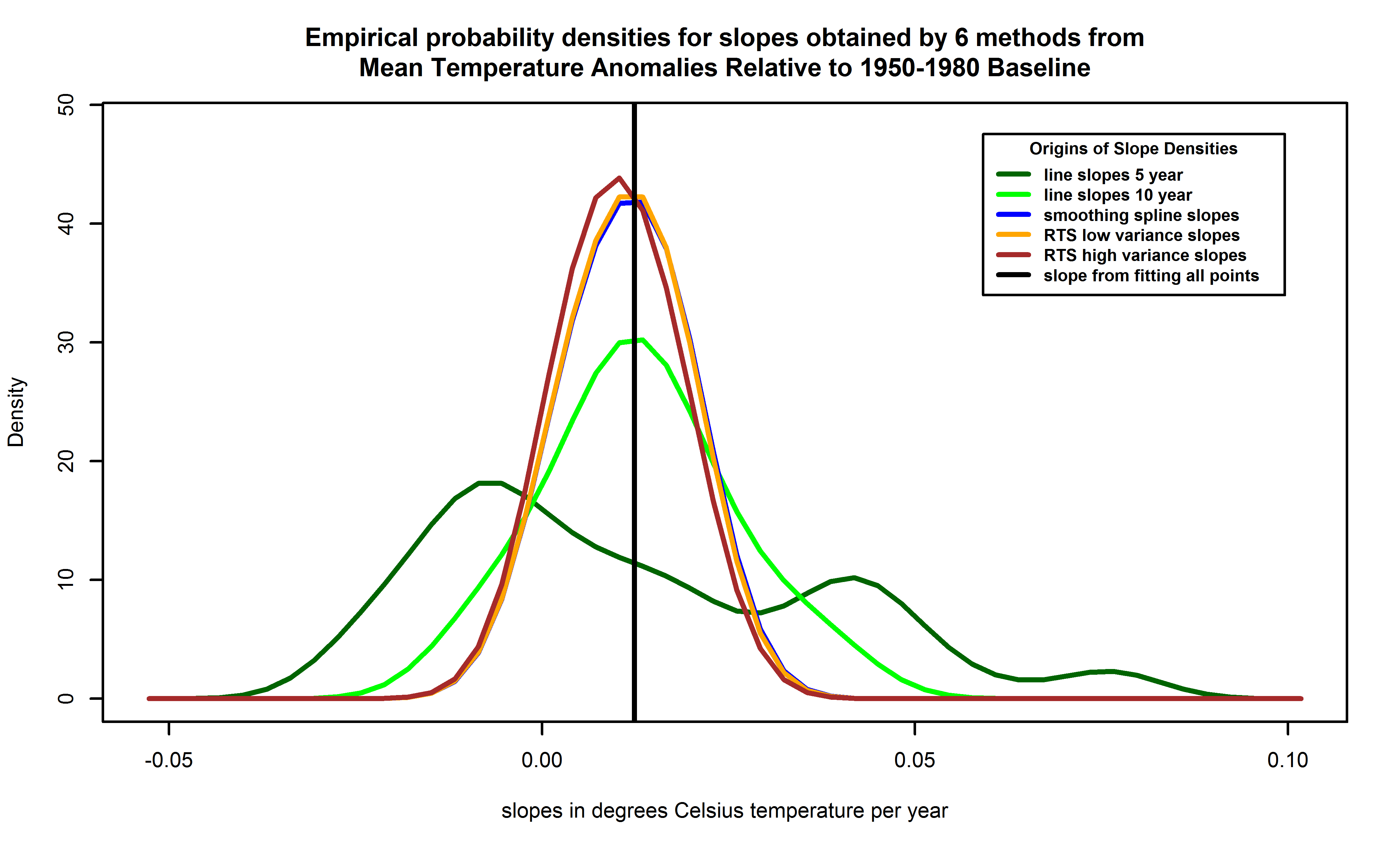
| Figure 14. Empirical probability density functions for slopes of temperatures versus years, from each of 6 methods. Empirical probability densities are obtained using kernel density estimation and are preferred to histograms by statisticians because the latter can distort the density due to bin size and boundary effects. Lines correspond to local linear fits with 5 years separation (dark green trace), the local linear fits with 10 years separation (green trace), the smoothing spline (blue trace), the RTS smoother with variance 3 times the corrected estimate for the data as the prior variance (orange trace, mostly hidden by brown trace), and the RTS smoother with 15 times the corrected estimate for the data (brown trace). The blue trace can barely be seen because the RTS smoother with the 3 times variance lies nearly atop of it. The slope value for a linear fit to all the points is also shown (the vertical black line). |
The Rauch-Tung-Striebel smoother is an enhancement of the Kalman filter. Let $latex y_{\kappa}$ denote a set of univariate observations at equally space and successive time steps $latex \kappa$. Describe these as follows:
|
Hiatus periods of 10 to 15 years can arise as a manifestation of internal decadal climate variability, which sometimes enhances and sometimes counteracts the long-term externally forced trend. Internal variability thus diminishes the relevance of trends over periods as short as 10 to 15 years for long-term climate change (Box 2.2, Section 2.4.3). Furthermore, the timing of internal decadal climate variability is not expected to be matched by the CMIP5 historical simulations, owing to the predictability horizon of at most 10 to 20 years (Section 11.2.2; CMIP5 historical simulations are typically started around nominally 1850 from a control run). However, climate models exhibit individual decades of GMST trend hiatus even during a prolonged phase of energy uptake of the climate system (e.g., Figure 9.8; Easterling and Wehner, 2009; Knight et al., 2009), in which case the energy budget would be balanced by increasing subsurface-ocean heat uptake (Meehl et al., 2011, 2013a; Guemas et al., 2013). Owing to sampling limitations, it is uncertain whether an increase in the rate of subsurface-ocean heat uptake occurred during the past 15 years (Section 3.2.4). However, it is very likely that the climate system, including the ocean below 700 m depth, has continued to accumulate energy over the period 1998-2010 (Section 3.2.4, Box 3.1). Consistent with this energy accumulation, global mean sea level has continued to rise during 1998-2012, at a rate only slightly and insignificantly lower than during 1993-2012 (Section 3.7). The consistency between observed heat-content and sea level changes yields high confidence in the assessment of continued ocean energy accumulation, which is in turn consistent with the positive radiative imbalance of the climate system (Section 8.5.1; Section 13.3, Box 13.1). By contrast, there is limited evidence that the hiatus in GMST trend has been accompanied by a slower rate of increase in ocean heat content over the depth range 0 to 700 m, when comparing the period 2003-2010 against 1971-2010. There is low agreement on this slowdown, since three of five analyses show a slowdown in the rate of increase while the other two show the increase continuing unabated (Section 3.2.3, Figure 3.2). [Emphasis added by author.] During the 15-year period beginning in 1998, the ensemble of HadCRUT4 GMST trends lies below almost all model-simulated trends (Box 9.2 Figure 1a), whereas during the 15-year period ending in 1998, it lies above 93 out of 114 modelled trends (Box 9.2 Figure 1b; HadCRUT4 ensemble-mean trend $latex 0.26\,^{\circ}\mathrm{C}$ per decade, CMIP5 ensemble-mean trend $latex 0.16\,^{\circ}\mathrm{C}$ per decade). Over the 62-year period 1951-2012, observed and CMIP5 ensemble-mean trends agree to within $latex 0.02\,^{\circ}\mathrm{C}$ per decade (Box 9.2 Figure 1c; CMIP5 ensemble-mean trend $latex 0.13\,^{\circ}\mathrm{C}$ per decade). There is hence very high confidence that the CMIP5 models show long-term GMST trends consistent with observations, despite the disagreement over the most recent 15-year period. Due to internal climate variability, in any given 15-year period the observed GMST trend sometimes lies near one end of a model ensemble (Box 9.2, Figure 1a, b; Easterling and Wehner, 2009), an effect that is pronounced in Box 9.2, Figure 1a, because GMST was influenced by a very strong El Niño event in 1998. [Emphasis added by author.]The contributions of Fyfe, Gillet, and Zwiers ("FGZ") are to (a) pin down this behavior for a 20 year period using the HadCRUT4 data, and, to my mind, more importantly, (b) to develop techniques for evaluating runs of ensembles of climate models like the CMIP5 suite without commissioning specfic runs for the purpose. This, if it were to prove out, would be an important experimental advance, since climate models demand expensive and extensive hardware, and the number of people who know how to program and run them is very limited, possibly a more limiting practical constraint than the hardware. This is the beginning of a great story, I think, one which both advances an understanding of how our experience of climate is playing out, and how climate science is advancing. FGZ took a perfectly reasonable approach and followed it to its logical conclusion, deriving an inconsistency. There's insight to be won resolving it. FGZ try to explicitly model trends due to internal variability. They begin with two equations:
 Figure 15. Figure 1 from Fyfe, Gillet, Zwiers.[/caption]
Accordingly, the dispersion of a forecast ensemble can at best only approximate the [probability density function] of forecast uncertainty ... In particular, a forecast ensemble may reflect errors both in statistical location (most or all ensemble members being well away from the actual state of the atmosphere, but relatively nearer to each other) and dispersion (either under- or overrepresenting the forecast uncertainty). Often, operational ensemble forecasts are found to exhibit too little dispersion ..., which leads to overconfidence in probability assessment if ensemble relative frequencies are interpreted as estimating probabilities.In fact, the IPCC reference, Toth, Palmer and others raise the same caution. It could be that the answer to why the variance of the observational data in the Fyfe, Gillet, and Zwiers graph depicted in Figure 15 is so small is that ensemble spread does not properly reflect the true probability density function of the joint distribution of temperatures across Earth. These might be "relatively nearer to each other" than the true dispersion which climate models are accommodating. If Earth's climate is thought of as a dynamical system, and taking note of the suggestion of Kharin that "There is basically one observational record in climate research", we can do the following thought experiment. Suppose the total state of the Earth's climate system can be captured at one moment in time, no matter how, and the climate can be reinitialized to that state at our whim, again no matter how. What happens if this is done several times, and then the climate is permitted to develop for, say, exactly 100 years on each "run"? What are the resulting states? Also suppose the dynamical "inputs" from the Sun, as a function of time, are held identical during that 100 years, as are dynamical inputs from volcanic forcings, as are human emissions of greenhouse gases. Are the resulting states copies of one another? No. Stochastic variability in the operation of climate means these end states will be each somewhat different than one another. Then of what use is the "one observation record"? Well, it is arguably better than no observational record. And, in fact, this kind of variability is a major part of the "internal variability" which is often cited in these literature, including by FGZ. Setting aside the problems of using local linear trends, FGZ's bootstrap approach to the HadCRUT4 ensemble is an attempt to imitate these various runs of Earth's climate. The trouble is, the frequentist bootstrap can only replicate values of observations actually seen. (See inset.) In this case, these replications are those of the HadCRUT4 ensembles. It will never produce values in-between and, as the parameters of temperature anomalies are in general continuous measures, allowing for in-between values seems a reasonable thing to do. No algorithm can account for a dispersion which is not reflected in the variability of the ensemble. If the dispersion of HadCRUT4 is too small, it could be corrected using ensemble MOS methods (Section 7.7.1.) In any case, underdispersion could explain the remarkable difference in variances of populations seen in Figure 15. I think there's yet another way. Consider equations (6.1) and (6.2) again. Recall, here, $latex i$ denotes the $latex i^{th}$ model and $latex j$ denotes the $latex j^{th}$ run of model $latex i$. Instead of $latex k$, however, a bootstrap resampling of the HadCRUT4 ensembles, let $latex \omega$ run over all the 100 ensemble members provided, let $latex \xi$ run over the 2592 patches on Earth's surface, and let $latex \kappa$ run over the 1967 monthly time steps. Reformulate equations (6.1) and (6.2), instead, as
| TEMPERATURE TRENDS | |
|---|---|
| 1997-2012 | |
| Source | Warming ($latex ^{\circ}\,\mathrm{C}$/decade) |
| Climate models | 0.102-0.412 |
| NASA data set | 0.080 |
| HadCRUT data set | 0.046 |
| Cowtan/Way | 0.119 |
| Table 1. Getting warmer. New method brings measured temperatures closer to projections. Added in quotation: "Climate models" refers to the CMIP5 series. "NASA data set" is GISS. "HadCRUT data set" is HadCRUT4. "Cowtan/Way" is from their paper. Note values are per decade, not per year. |